
The digital equivalent of every object being in its spot.
- Daily destinations visible without a search ritual
- Separate contexts without duplicating a whole setup
- Enough control to make the screen feel personally coherent
Design notes from Joey Wright
I spent ten years in graphic design, fifteen in photography, and most of that time making some kind of web experience. After a decade of adapting myself to other people's new-tab tools, I finally designed the one my brain had been asking for.
Disclosure: I designed and built SpeedGrid. This is a teardown of my own work, including the choices I rejected and the constraints that shaped it.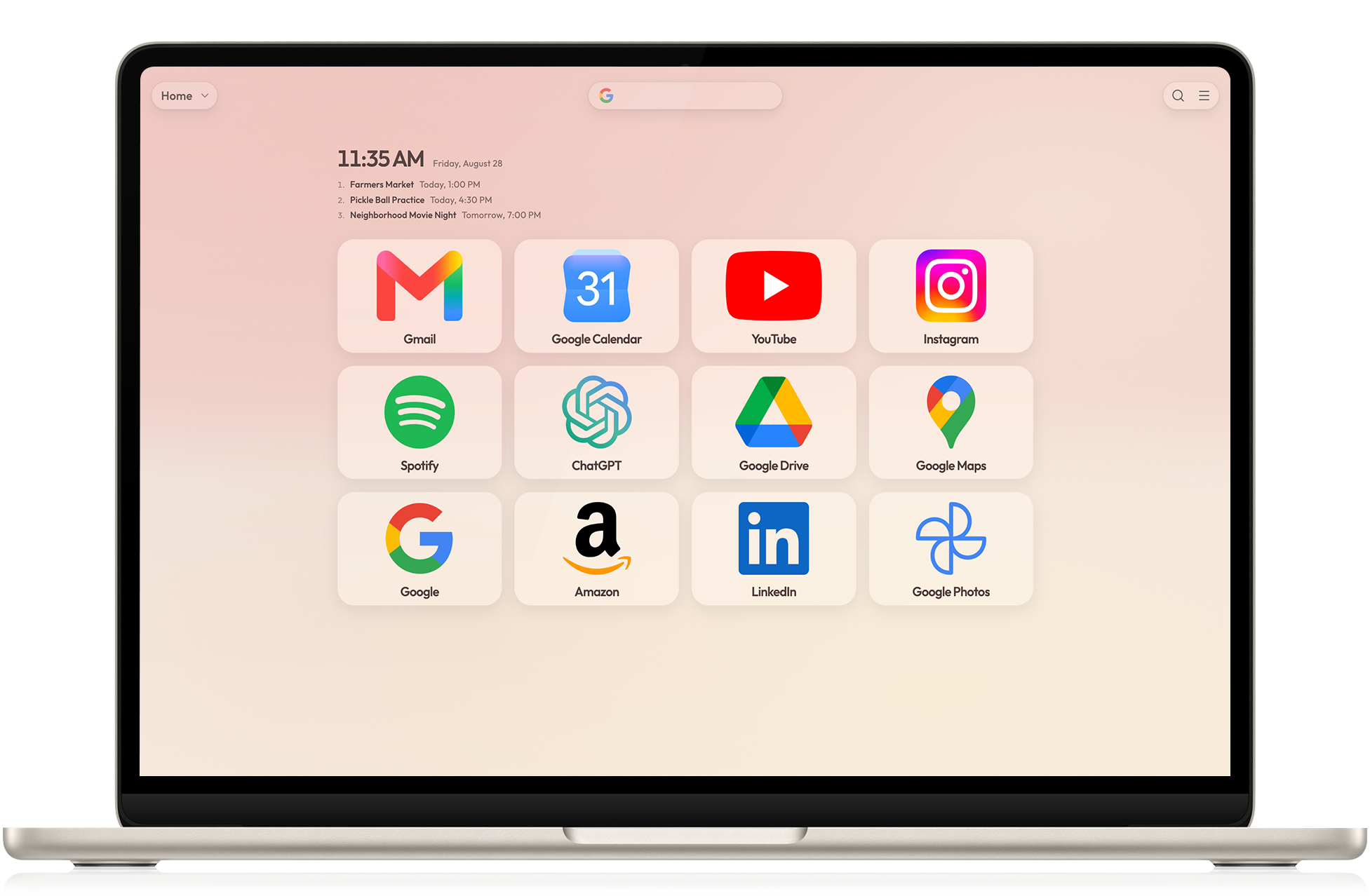
The central tension
Five design decisions
Folders hold broad parts of life; grids hold the destinations needed in one mode. That keeps Work, Home, Travel, and Creative available without asking every shortcut to coexist on one screen.
A stable position, familiar mark, and consistent color are faster than a label. The card title still matters, but it confirms what the eye already recognized instead of carrying the entire interface.
Type, card shape, spacing, shadows, and color belong to reusable profiles. A theme should change the character of the whole workspace—not sprinkle unrelated customization on top of it.
Small cards grow slightly on hover without jumping away from the pointer. Product graphics move while scrolling only when the motion reveals a relationship, such as a second destination or a focused search menu.
The warm cream canvas keeps the page from feeling clinical. Cooler shadows, restrained borders, and short blue accents give it definition without turning every component into a floating glass panel.
The browser extensions do not ask for browsing-history access. Backups, export tools, and visible restore points matter because a carefully arranged workspace becomes more valuable the longer someone uses it.
The editing pass
Calm did not come from making everything beige. It came from deciding what the screen should not ask the user to process.
Editing tools belong near the object being edited and should arrive through a clear interaction—not stay permanently visible as a tax on every new tab.
A card can hold two named destinations when they are conceptually paired. That is more useful than shrinking twice as many cards into the same space.
If a still image already communicates the feature, it stays still. If the change itself is the idea, the motion begins only after the initial state has been visible long enough to understand.
Desktop gets scale, negative space, and a laptop that can be the star. Mobile removes secondary boxes, changes reading order, and lets supporting text scroll rather than compress into unreadable rows.
A personal product, deliberately shared
The first themes include photographs from years of travel because those images already shaped how I wanted the browser to feel. Community palettes such as Catppuccin, Rosé Pine, Dracula, and Alucard now sit beside them. The point is not a finished catalog; it is a visual system that can keep becoming more personal without becoming more chaotic.
The first page of the next decade
Explore the live product tour, the visual profiles, and the decisions behind a workspace built to feel settled before the day begins.
Explore SpeedGrid